
Goals
Develop design and writing guidelines to create UI and documentation that are:
- Correct, clear, and concise
- Modern
- Understood by an international audience, and optimally minimize the need for complex (and expensive) translation processes
- Applicable to multiple platforms and devices
GAM Style Guides
We’ll take information and advice from these three style guides:
https://material.google.com/style/writing.html
Apple
https://developer.apple.com/design/tips/
Microsoft
Search for the title and you can download a PDF of the 4th edition. See also https://developer.microsoft.com/en-us/windows/desktop/design
And here’s text and tone:
https://msdn.microsoft.com/library/windows/desktop/dn742476.aspx
Technical Writing Guidelines
To keep this guide accurate and low-maintenance, many of the following subsections don’t contain examples. Refer to the technical documentation for up-to-date examples. If the standards and conventions used in the technical documentation contradict what is stated here:
- Ignore the outdated guideline and follow the current standards and conventions shown in the technical documentation.
- Contact the technical documentation team to update this section.
Bold
Use bold format for:
- UI elements on a window, like titles, fields, and buttons.
- Certain text in tables; see Tables.
- Titles of Capriola Cloud guides and publications by other authors.
To avoid a lot of bold text on the page, only bold the UI of the primary window or windows that you are currently describing in the topic. Whether you bold the UI of secondary windows depends on usage:
- If you’re simply mentioning the secondary window, don’t bold.
- If the secondary window is part of a procedure, then bold.
Captions
Delete bold Title and use plain Caption text.
Use title case when the item or element is titled, like a video. Otherwise, use sentence case.
Code
Check that your project was created from the Technical Documentation Template-2019. This contains code patterns in Add Pattern > Code.
Code examples can have four colors:
- blue: span class=”tag”
- green: span class=”value”
- gray: span class=”comment”
- white: no span class
For command line code examples and very long code examples, use the span class=”tag” to quickly color the text blue. Otherwise, not only will you have to do a lot of manual code formatting, the example could be overwhelmingly colorful.
Use the <code> tag in Code Mode to manually format text.
Contractions
See the Google, Apple, and Microsoft guidelines in GAM Style Guides.
Use common contractions heard in everyday conversation, like it’s, can’t, don’t, doesn’t, and won’t. Don’t use contractions that use Old English words, like shan’t (shall not) or American slang, like y’all (you all).
Don’t create contractions from a noun and a verb.
Incorrect: Capriola Cloud’s going to . . .
Correct: Capriola Cloud is going to . . .
Copyright
As shown, with small font.
© 2013–2019 Capriola Cloud, Inc. All rights reserved.
Date
MM/DD when year not necessary: March 1
DD/MM/YYYY when year necessary: 1 March 2016
Don’t use the common US format of MM/DD/YYYY.
If giving the full date and using only numbers, indicate the date is in DD/MM/YYYY format so that users understand the date is not in the common US format.
Feature matrix
Use the Features Matrix pattern in the Pattern Panel.
Headings: Case
Title case for guide titles and units. Sentence case for all other headings.
Headings: Structure
Standard structure is imperative verb and noun:
Manage Projects
Also imperative verb and past tense verb:
Get Started
Keep titles concise. Aim for five words or less.
Icons
Use .svg files for icons in the end user guides. Use the blue (hover state) or a dark colored icon; avoid using the gray icons. Talk to the design team if you can’t find an icon.
https://git.capriolacloud.com/pages/web/icon-box/
Use the Inline Icon pattern in Add Pattern > Images.
The icon is placed before the icon name. See the Authoring Guide for examples.
Images
- Use the Capriola Cloud test projects for your images, .gifs, and videos. Double-check that the content is ready for publication and doesn’t include obvious test data.
- Focus the image on the desired element or elements. Minimize visual noise by closing unnecessary panes and windows.
- Be sure to blur sensitive and test data like names, API key information, and URLs.
- Check that the image is complete and that nothing is abruptly or awkwardly cut off.
- To avoid the issue of red-green color blindness, use a blue or gold color for any kind of callout, like arrows, circles, squares, and rectangles.
- You can also use copyright-free images in the public domain. This Buffer Marketing Library article has links to 24 sites offering free images.
Internationalization
- Write for a diverse global audience.
- Create user names of various ethnic backgrounds for examples and images.
- Note that humor, slang, jokes, colloquialisms, and similar may translate badly or not at all. Check with the translations team or a native speaker. Don’t rely on a translation app, like Google Translate.
- Be careful with the use of symbols, colors, and similar, which generally have different meanings in different cultures.
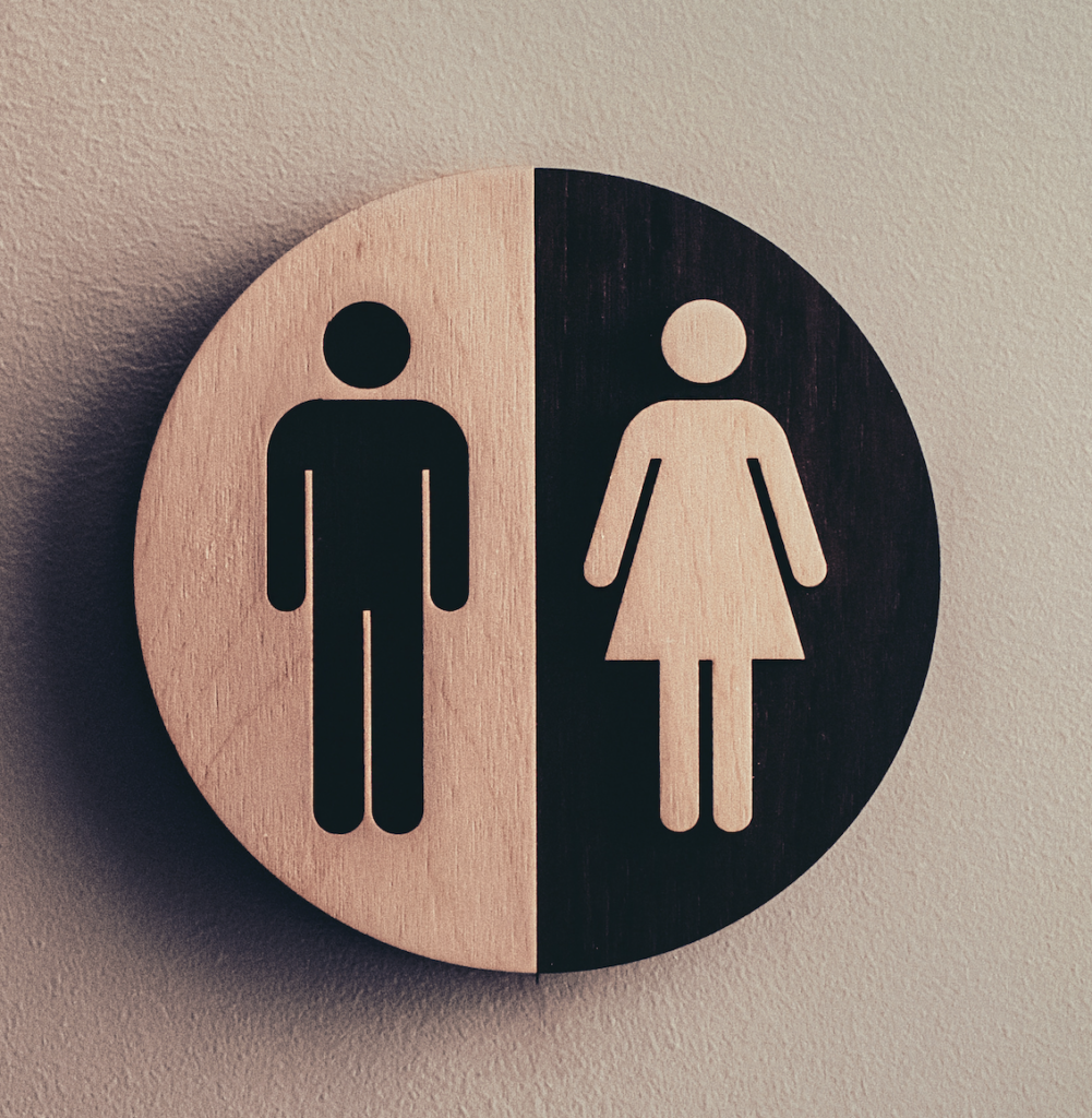
- Determine if any content, especially images, might be deemed insensitive or offensive and require replacement during the translations process. Pay special attention to any depictions of the human figure. Ensure that hand gestures don’t have a vulgar meaning.
For example, consider restroom sign designs. In the image below, the female figure lacks a veil and her dress length exposes her legs. Another example would be restroom signs at a beach or pool with the figures dressed in swim suits. In other cultures, this iconography would be considered indecent.
Italics
Use to format topic titles. Format guide titles in bold.
You can also italicize text for emphasis and term descriptions within paragraphs, but do this sparingly.
Keyboard shortcuts
Add a space between each character: Cmd + M
Currently, we’re using words instead of symbols, like Cmd for Mac.
Links
Within a topic or guide
AKA intra-topic links or intra-guide links.
Keep links within a topic or a guide as concise as possible, optimally 3-5 words.
Across guides
AKA cross-guide links.
Include the guide name with cross-guide links. This can help users still find the information if the link is broken for any reason.
Begin cross-guide links with See, See also, For more information, or For more information about {something}.
Format topic titles in italics and guide titles in bold.
Examples
See linked topic title in the guide name.
For more information about {something}, see these topics in the guide name:
- linked topic title
- linked topic title
Lists: General
See General Guidelines and Mobile App Store Release Notes.
Lists: Intros
The Chicago Manual of Style standard recommendation for introducing lists is too formal for our company voice and brand. Minimize use of as follows, the following, and similar.
Lists: Styles
See styles available in Add Pattern > Lists.
- Plain bullet
- Plain blue bullet
- Checkbox: Use when you’re giving reader a list of items or points to do or verify.
- Checkmark: Use when you’re giving reader the benefits or pros of something.
- Exmark: Use when you’re listing cons or undesirable consequences of something.
Measurement units
Use metric units, and put a space between a measurement and its unit:
5 MB
If customary US units (imperial units, like inch, yard, foot, mile, and lbs) are also necessary for the content, put the measurement and its unit in parentheses after the metric notation:
5 kg (11.02 lbs)
Notes
Use the correct aside pattern from Add Pattern > Asides.
Keep the original title of the aside (like Tip or Note) so users have a consistent experience. Don’t change it to a statement or question. One exception to this is the use of Change your permissions for the tip title in Authoring Guide overviews.
Check that the tone matches the note. For example, a warning should have a strong voice and not describe recommendations or best practices.
- Tip: Helpful information, shortcuts, links to additional resources.
- Note: Additional information useful for the reader to know.
- Important: Additional information the reader should consider before taking the action.
- Warning: Information the reader should consider before taking an action because that action that might have undesirable or irreversible consequences.
Spelling
US English spelling, like color instead of colour.
The translations team will handle all necessary conversions.
Tables
Table C in Add Pattern > Tables. This pattern is configured with the necessary style defaults, such as column headings formatted in bold and alternating shaded rows.
No title.
In a term table, use bold sparingly. Don’t bold UI element names in a Term (or Item or Element or Dashboard link) column. If your table includes a Description column, you can bold UI element names and the introductory words Note and Important! for notes.
Time
Follow the UI:
- Use AM and PM if the UI shows a 12-hour clock system:
1:30 PM - If the UI shows a 24-hour clock system, the format must be nn:nn. Times from 00:00 to 09:59 must include the first zero.
- Include the time zone, if it displays in the UI and is applicable to the specific topic or task being described.
Videos
- Use the light blue Content Section: Highlight pattern from Add Pattern > Sections.
- Left align the title Watch a video. Keep title at the H2 level.
- For our our training videos, the title must match what is published on the Wistia site. The title is in title case, in the Caption field and in bold font.
- Use copyright-free videos in the public domain, such as: http://www.spacetelescope.org/videos/
Voice and tone
Simple, straightforward, and conversational yet still professional. Like a coworker or trainer at your side, looking at the UI with you.
Use the active voice. Keep passive voice to a minimum.
Use we, not Capriola Cloud.
Ask yourself who is doing the action: human or computer?
See the guidelines noted in GAM Style Guides.
Widgets
We generally use the Slideshow and Sideline widget.
Use the Add Title and Add Caption fields in the editor to enter a title and caption that display below the widget.
Usage
B
back button
Lowercase and not in bold because not all browsers refer to this as the Back button.
K
key-value pair
P
please
Due to possible etiquette and translation issues, use please sparingly, and only when the user is truly inconvenienced.
See the guidelines noted in GAM Style Guides for the appropriate use of this word.
T
thank you, thanks
Due to possible etiquette and translation issues, use thank you and its variations sparingly, and only when the user truly needs to be thanked.
See also the entry for please.
title
Use title when referring to the actual title of a document (book, manual, guide) or media file. Don’t use title as a generic term for any published work.